Sometimes adapting and reusing are two different actions. A recent visit to Philadelphia got me thinking about the definition of both words, and what happens when architecturally they aren’t used together. Two very different approaches to existing and new buildings got me thinking about how many different ways buildings can and should be treated. And that what’s right for one, may not be for another.
Reusing the Former Philadelphia Stock Exchange
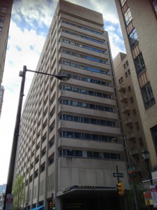
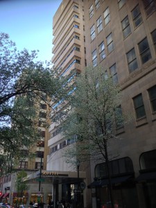
The International Style Philadelphia Stock Exchange building is one modern Pennsylvania building that found a new use without the drama that we saw surrounding the demolition of the Gettysburg Cyclorama. The luxury Sofitel Hotel in the business core of Philadelphia, near Rittenhouse Square, is a modernist dream designed by Vincent Kling & Associates in 1965 as the Philadelphia Stock Exchange. The fourteen story concrete and steel building was adapted into 306 rooms, opening in May 2001.
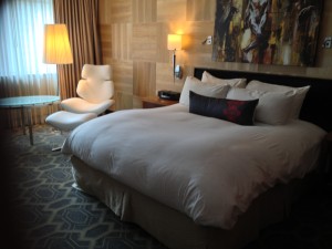
The hotel renovation was designed by Brennan Beer Gorman Architects from New York City. Little remains of the original interior and a quick Google search did not offer any images of what the original contained, whether there were any grand entry or meeting spaces that were lost. But the joy of staying at this fabulous and now luxurious modernist structure with exquisite hotel interiors was the best of both worlds.
Adapting the Concept of an Original Museum
The new LEED Platinum certified Barnes Foundation Museum is one of the most contentious and controversial design projects in the museum world. Classical architect Paul Cret designed the museum in 1922 in Merion, suburb of Philadelphia, for Albert Barnes, a chemist who collected art after making a fortune by co-developing an early anti-gonorrhea drug marketed as Argyrol and selling his company at the right time, before antibiotics came into use. Barnes collected Modern and Impressionist masterpieces, which are estimated today to be worth in the $25 billion range. By the 1990s, financial woes, a suburban location difficult to access, little room for expansion and a deteriorating original building led the board to petition the courts to remove the restrictions placed on the running of the museum. Whole dissertations are being written on this project and its legal actions, which I will not try to explain, but instead will send you to the Wikipedia page as a start (it has a very good list of primary references).
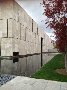
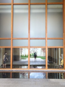
Designed by Todd Williams Billie Tsien Architects, the construction for the new building started in Fall 2009 and was completed in May 2012. The new facility houses the collection in galleries that replicate the scale, proportion and configuration of the original Merion galleries and while I never visited the original museum, I understand that more natural lighting in the form of a light box hovering over the building has improved the viewing experience. The new site contains increased space for the foundation’s art education program and conservation department, a retail shop, and cafe. The architects say that the new museum was “conceived as a gallery in a garden and a garden in a gallery. “ The fossilized limestone cladding and light box skylighting weave the remade galleries and new public spaces together. Like most of their work, the building is a stunning piece of sculpture with breathtaking views around each corner and at the end of each hallway. The lighting brings out the richness of the limestone, even on the overcast day I visited it. The galleries and placement of the art, which replicates the original, are quirky and overwhelming. I’ve never seen so many Modiglianis, Picassos, Renoirs and Cezannes together on one wall. It’s hard to focus on any one painting. I do find the intermittent placement of old door hardware throughout the paintings amusing though. Photography of the galleries is not allowed but the TWBT website has some terrific photos.
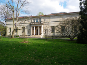
The original Barnes Foundation museum in Merion, Philadelphia where the foundation’s headquarters remain. Photo courtesy Wikipedia.
When this story was playing out in the courts and the media, my initial thoughts were that the will and desires of the founder should be inviolate (the indenture of trust stipulates that the paintings in the collection be kept “in exactly the places they are”). The original site is also an arboretum. One of the main reasons argued by the board for its relocation was the need to place it in a more readily accessible location. Philadelphia offered a site on Benjamin Franklin Parkway in the cultural core of Logan Square. My colleague and I thought it rather amusing that the day we visited, while it was busy, all of the visitors were of a certain age, hair color and economic class. And no children were in sight. But it was a Friday afternoon after all. It is a gorgeous building and site however and it is an intriguing juxtaposition of original concept and new form. I found the main entry court rather too large and the least interesting of all the spaces – obviously a gesture towards big galas and fundraising events. The original site now houses the foundation’s headquarters.
Two Years & Counting
As a celebration of my firm’s two-year anniversary I will be posting each day this week about places I’ve visited in the past year. The adaptive rethinking of both of these Philadelphia buildings reminds us that landmarks can be old, renovated, new or even a combination. And what matters most in one (the hotel) may mean nothing in the other (the museum).
And if you’d like to “subscribe” or follow my blog, True Green Cities, please sign up through the “Subscribe” button at the bottom left of this page. You’ll receive a daily recap when new blogs are posted. Or Sign up for the Feed.

