Austin, Texas has a well-deserved reputation as a forward thinking “green” city and it is indeed very well deserved. I spent three days in Austin in October speaking to the students at the University of Texas Architecture School and giving a workshop at the AIA Texas annual conference. I was treated with a stay at the University of Texas at Austin’s campus in a contemporary LEED certified luxury hotel, was given tours of the historic buildings on campus soon to have green rehabs and dodged bicycles and pedestrians everywhere. The weather was divine in October – the city was green and lush, and everyone seems to think that this is a special place, whether you live there or visit. It’s hard not to get caught up with “Keeping Austin Weird!” Keeping Austin Weird is the slogan adopted by the Austin Independent Business Alliance to promote small businesses in Austin and it’s come to mean the innovation and sustainability that Austin has become famous for.
A Masterful Master Plan
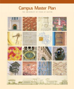
A campus master plan for UT Austin was prepared in 1999 by Cesar Pelli & Associates and Balmori Associates.
I had one perfectly glorious day to myself where I never left the campus and just wandered around photographing the details and the views. Today the university has 48,000 students but because of the beautifully balanced zones on the campus, it never felt crowded or overwhelming. The university had a masterful master plan prepared in 1999 by Cesar Pelli Associates (now Pelli Clarke Pelli) & Balmori Associates, which is a continuation of a long history of inspired master plans. The entire master plan can be downloaded from the UT website and if you have interest in seeing an inspired master plan, then I encourage you to look at it. Classical architect Paul Cret designed the core master plan of the campus in 1933 using previous contributions by Cass Gilbert in 1909 and James M. White in 1923 and Greene, LaRoche, and Dahl in 1928.
The following excerpt from the Introduction sets the stage for the master planning very well:
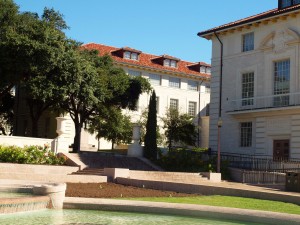
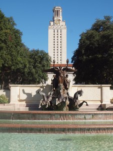
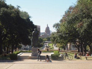
One of many lovely views at the UT Austin campus, balancing historic buildings and foliage with open spaces.
The original 40 Acres, deeded to the University in 1881 by the State of Texas, located the campus on a hill, creating a powerful and enduring image. Even though these 40 Acres, first called “College Grove” and then “College Hill,” were set aside in 1839 by the City of Austin, the location of the University was determined by vote of the people of Texas in 1881. Austin won the election, and the 40 Acres were then given to the state to use for the proposed University. The eventual placement of buildings and open spaces within these 40 Acres was beautifully balanced. The scale and splendor of trees and topography, and the equilibrium between the constructed environment and the open spaces continue to play a critical role in public perceptions of the campus. The Cass Gilbert master plan for The University of Texas at Austin established the Spanish Mediterranean character of the campus structured by a cross axial plan. However, it was Paul Cret’s 1933 master plan that most significantly established the future design direction for the 40 Acres and served as the model for the overall character of the University. Cret’s plan recommended shaping exterior spaces into courtyards and using building walls to define the larger open space. The result was a superb, powerful and axial organization.
A Return to the Architectural Vocabulary of Paul Cret

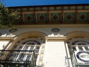
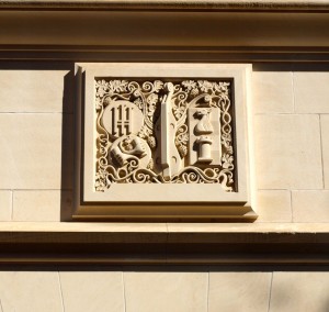
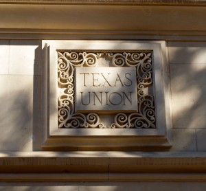
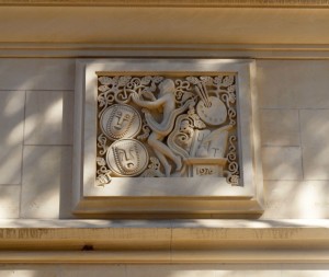
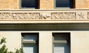
Every building on the UT Austin campus has some sort of fabulous sculpture, carving or architectural feature like their famous longhorns.
The master plan seeks to reconnect with the best of Paul Cret’s intentions for a campus that unites architecture and open space as a unified environment. The organizing principles of the master plan include returning to the equilibrium between building and open space and creating a unified system for vehicular and pedestrian traffic and a strengthened identity of place. Fourteen years later, as the principles of the master plan continue to shape the restoration and new construction on the campus, the buildings are being systematically upgraded, making them as green as possible, targeting LEED Gold in most cases.
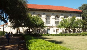 The School of Architecture, Battle Hall, designed by Cass Gilbert in 1911 is the next big sustainable preservation project on campus. Originally built as the Main Library for the campus in Spanish Mediterranean Revival style, it was the first building built using that style, and its influence continues today since Cret’s master plan and now the current one have identified the Spanish Revival as the preferred architectural style, particularly the red tile roof, limestone walls and overhanging eaves.
Two Years & Counting
As a celebration of my firm’s two-year anniversary I have posted each day this week about places I’ve visited in the past year. Today is the last day of the week’s celebration and I’m happy to share some photos of some of the great architectural details and views that can be found throughout the campus.
And if you’d like to “subscribe” or follow my blog, True Green Cities, please sign up through the “Subscribe” button at the bottom left of this page. You’ll receive a daily recap when new blogs are posted. Or Sign up for the Feed.

